Have you downloaded a mobile app just to get frustrated on the onboarding flow of the app?
You are not alone.
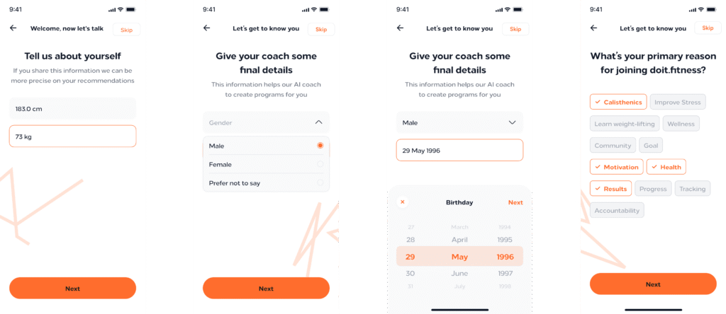
I have been trying to research what works best for my fitness app since I started doing the high-level prototypes in Figma. But I keep asking myself If I am introducing too many screens in this important flow.
Since I need to collect some personal data that is related to the user fitness level, I will need at least 5 to 7 screens just to collect the user goals, their height and weight and workout preferences. In addition, I also need to show them my paywall during this process.
Many apps out there have a very streamline onboarding process, but I feel like there is a proper balance between what is “considered” too much screens on the onboarding versus the quality of the users you will get after they come though those sets of screens.
For example, if you just make the user lands on your “Dashboard” without proper introducing they might feel lost, or might not know what to expect, and this is particular frustrating for many, which consequently might affect your conversion rates.
On the other hand, if you make the user feel like we made an app just for them and customize the user experience based on what you’ve collected during the onboarding flow, the chances of you getting a user that stays is way higher.
So probably optimize your onboarding flow for what increase conversions for your particular use-case. Test as many variations as possible to find the right size of screens and questions so you can make your users feel that they are at home.
Leave a Reply